ShopDreamUp AI ArtDreamUp

Deviation Actions


Suggested Deviants


Suggested Collections


You Might Like…


Featured in Groups

Comments66
Join the community to add your comment. Already a deviant? Log In
As I promised, here is my critique!
Well I think I might try a new structure, based on 4 points suggested by dA.
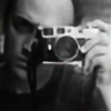
_Vision : Good but not great. Very contrasted B&W with a good subject is almost always a hit.
However there are a major and a minor issue in your compo :
The source of light definitely doesn't bring anything, it's only an over-exposed area on the photography, and it also breaks the hole poetry of the image. Most of the time I don't like bringing technological elements to a picture if they don't have a special meaning. I don't know why you decided to make it appear it, but to my mind it was a mistake.
The minor issue is the overall shape of your composition. I do appreciate square photos when they have a reason to be that way, but here I think it's the exact contrary of what you needed. Horizontal would have played with the rythm of the eyes much more effectively, and vertical would have strenghthened the vertical character of the background. But to me, square compo doesn't bring anything, it makes the rythm to be forgotten a little bit and makes that light appear.
_Originality : originality in photography is always a tough debate. But here, definitely, you closed it. Even if you borrow some of the well known codes of B&W (dark face, very high contrast), it is to make something completely new.
_Technique : Overall it's pretty good. However, the burned area caused by this light of the two center foreheads is a bit annoying. I think it might have been avoided by making a photo for the background and an other one for the man, which would have allowed you to give his face a bit more contrast. Apart form this, it's pretty close to perfection on the rest of the picture.
_Impact : Five stars there! A very eyecatching picture, playing with deeper meaning. I really like the substitutions of the character's eyes to the wall eyes. Short paragraph, but what can you say when it's perfect?
_Overall : I definitely love this, and i wouldn't bother to make a critique if I wouldn't. There some issues, but they do not attempt to the spirit of the artwork. However, if they weren't there, this artwork might have ended in my living room, to tell you how much I like it.
I hope this is both an pleasant and useful critique, as you deserve to get one for this artwork. Keep it up, you have a gift for choosing your subjects.